

That's Our Pop! - Page 3
 |
|
|
 |
 |
 |
|
|
|
|
Fans of soft drinks, or simply of graphic art and product design, have much to admire in the romance of soda pop.
Just let the names of favorite old-time and regional sodas trip through your head. Nehi. Big Red. Chocolate Cow. Mello Yello. (Yes, it appeared after that Donovan song). Sno-Maid. Ace-High. Heep Good. Bubble Up.
And you can love soda even if you’re afraid to drink it. You can imbibe it through your eyes as a form of visual art and social history.
True, those reproduction Gay Nineties’ Coca-Cola trays that are displayed at so many beachside ice cream parlors may be old hat. But any number of soda pop makers turned to more modern looks, through the Art Nouveau era of the late 19th century and the Art Deco of the Twenties and Thirties.
Turn, however, to the mid-20th century and there is much to admire. Some brands adopted a modernist look for at least some of their packaging and promotions, including Squirt, with its late-1940s cartoon of a young Squirt fan and its red, squirt-shaped tear. Squirt’s serpentine green bottles from the mid-1950s are quirkily modern as well as functional, designed to remain firmly in your hand.
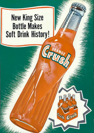
Another wonderfully shaped bottle from the 1950s, dubbed by collectors the ‘Mae West’ for its exaggerated curves, was gifted to the world by Orange Crush.
Dr. Pepper, one of the oldest brands, tracing its roots to an 1880s soda fountain in Waco, Texas, produced one of the most graphically advanced lines of bottles and cans in the 1950s, the ‘candy-striped’ series, vertical strips of yellow and red on a burgundy background, suggesting the color field art that painters like Kenneth Noland were turning out at the time.
7 Up also paid attention to contemporary trends in fine art, apparently basing its 7 Up neon signs of the 1960s on the look pioneered by fluorescent light artist Dan Flavin. In the 1970s, the company produced a tin lithograph suggesting the psychedelia of artist Peter Max.
What may be the most graphically sophisticated soda ever, Tab, hit the market in 1963. Coca-Cola’s successful attempt to attract people who wished to keep a ‘tab’ on their weight was the country’s second diet soda. Its original bottle, featuring a textured lower portion for a sure grip, was peppered with classic mid-century modern starburst patterns. The ‘A’ in ‘Tab’ was itself startling, with its wonderful spiral.
Tab continued its graphic innovations in 1970, turning to yet another trend in fine arts minimalism, to produce containers decorated with a repeating grid pattern, a la painter-sculptor Sol Lewitt or sculptor Carl Andre.
Still, when the history of soda pop design is written, cartoons, pulp magazine illustration, and Hollywood will all play a larger role than the Museum of Modern Art.
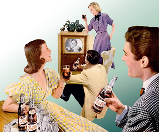
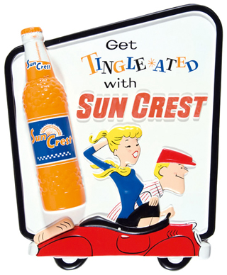
Consider the 1958 ‘Get Tingle-ated with Sun Crest’ campaign, filled with bright cartoon figures, their eyes a blaze of starbursts, dancing to LPs or zooming by in sports cars. Coke, Pepsi, Orange Crush—virtually every brand used top commercial artists to show people enjoying their ware on the beach or lazing around the barbecue.
Some soda collectibles are a bit more unusual, including a wonderful Pepsi Cola transistor radio from the early 1960s that was designed to look like a soda fountain dispenser.